I check StackOverflow now and then for UWP questions that aren’t sniped by people trying to get quick and easy reputation (read: tougher questions or those that need quite some effort). I first thought that this one would be another simple ‘point to the default styles’ question, until I looked deeper into it. It turned out to be a fun and challenging hour of coding.
Task at hand
The questioner on StackOverflow wants to increase the dot size of the ProgressBar.
So why isn’t it one of those default easy style questions? Let’s dig into the default ProgressBar style and zoom in on the actual ellipse parts in question.
<Border x:Name="B1"
        Grid.Column="8"
        RenderTransformOrigin="0.5,0.5">
    <Border.RenderTransform>
        <TranslateTransform />
    </Border.RenderTransform>
    <Ellipse x:Name="E1"
             Fill="{TemplateBinding Foreground}"
             Width="{Binding RelativeSource={RelativeSource TemplatedParent}, Path=TemplateSettings.EllipseDiameter}"
             Height="{Binding RelativeSource={RelativeSource TemplatedParent}, Path=TemplateSettings.EllipseDiameter}"
             RenderTransformOrigin="0.5,0.5">
        <Ellipse.RenderTransform>
            <TranslateTransform />
        </Ellipse.RenderTransform>
    </Ellipse>
</Border>
<Rectangle Grid.Column="7"
           Width="{Binding RelativeSource={RelativeSource TemplatedParent}, Path=TemplateSettings.EllipseOffset}" />
My initial idea: let’s just increase the EllipseDiameter value and we’re done. Both the TemplateSettings and the EllipseDiameter are read-only properties, bad luck there.
So what are the alternatives to increase the size?
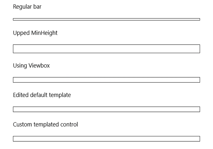
Yes, you could make a new style being a copy from the default style and edit those properties. But 297 lines of XAML is quite a bit and you’re now introducing a fixed version of that template. If the product team happens to improve the visual tree or change some of the used styles or dependency properties in a future Windows SDK version, you’re in for extra work. I did in my sample app to make a small rollercoaster bar, which looks funny … but I’d like to prevent this approach in a large sized app with several customizations to maintain.
The easiest one by far is using a ViewBox control, which scales whatever is in the container from its original size to the available size. Works perfect, but isn’t the cleanest fix and could even introduce blurry graphics if you size up too much.
Templated control
So back to step one: what about TemplateSettings? Template setting classes are part of the Windows.UI.Xaml.Controls.Primitives namespace and contain read-only properties to be used in XAML when creating control templates. If you want to know more, this MSDN page is the entry point.
So we want to mess with control templates? Let’s create a templated control (also known as custom control) in our project so we can start customizing the looks of our progress bar. The TemplateSettings property is not only read-only, but the ProgressBarTemplateSettings type is also sealed. So far for using inheritance. Digging into the metadata, you’ll notice this type inherits from DependencyObject and IProgressBarTemplateSettings (which is internal) and has a limited number of properties. So I simply created my own type with the same properties.
public class MyProgressBarTemplateSettings : DependencyObject
{
    public double ContainerAnimationEndPosition { get; set; }
    public double ContainerAnimationStartPosition { get; set; }
    public double EllipseAnimationEndPosition { get; set; }
    public double EllipseAnimationWellPosition { get; set; }
    public double EllipseDiameter { get; set; }
    public double EllipseOffset { get; set; }
    public double IndicatorLengthDelta { get; set; }
}
Next step is creating my own control derived from the default ProgressBar control (as I’m not planning to rewrite the control from scratch). I intentionally hide the TemplateSettings property of the base control with the new keyword.
public sealed class MyProgressBar : Windows.UI.Xaml.Controls.ProgressBar
{
    public MyProgressBar()
    {
        this.DefaultStyleKey = typeof (MyProgressBar);
        this.Loaded += (sender, args) => TemplateSettings = new MyProgressBarTemplateSettings(this);
    }

    public static readonly DependencyProperty TemplateSettingsProperty = DependencyProperty.Register(
        "TemplateSettings", typeof (MyProgressBarTemplateSettings), typeof (MyProgressBar),
        new PropertyMetadata(default(MyProgressBarTemplateSettings)));

    public new MyProgressBarTemplateSettings TemplateSettings
    {
        get { return (MyProgressBarTemplateSettings) GetValue(TemplateSettingsProperty); }
        set { SetValue(TemplateSettingsProperty, value); }
    }
}
Now I simply have to fill in some values for these properties. I don’t know the algorithms behind the properties, but looking at what came out of the ProgressBar control properties, I somewhat aimed for the same numbers based on the control’s width (which I have once the control is loaded).
public MyProgressBarTemplateSettings(MyProgressBar progressBar)
{
    ContainerAnimationStartPosition = -1*progressBar.ActualWidth / 10;
    ContainerAnimationEndPosition = progressBar.ActualWidth * 3/8;
    EllipseAnimationEndPosition = progressBar.ActualWidth * 2/3;
    EllipseAnimationWellPosition = progressBar.ActualWidth / 3;
    EllipseOffset = 4;
    EllipseDiameter = 12;
}
There are probably better ways to calculate these values, but this works for me.
Now there’s one thing left: a templated control has a template defined in the Themes/Generic.xaml file. As I derive from ProgressBar, I can copy the default template and simply change the TargetType properties.
<Style TargetType="local:MyProgressBar" >
    <Setter Property="Foreground" Value="{ThemeResource SystemControlHighlightAccentBrush}" />
    <Setter Property="Background" Value="{ThemeResource SystemControlBackgroundBaseLowBrush}" />
    <Setter Property="BorderThickness" Value="{ThemeResource ProgressBarBorderThemeThickness}" />
    <Setter Property="Maximum" Value="100" />
    <Setter Property="MinHeight" Value="{ThemeResource ProgressBarThemeMinHeight}" />
    <Setter Property="IsTabStop" Value="False" />
    <Setter Property="VerticalAlignment" Value="Center" />
    <Setter Property="Template">
        <Setter.Value>
            <ControlTemplate TargetType="local:MyProgressBar">
     ...
Wait what? We did all this work to yet again copy all 297 lines of XAML and simply change the TargetType properties? Now that would be silly right? Since I’m intentionally hiding the TemplateSettings property with the new keyword, this property exists and my derived type’s values are used. So we can simply use the style of ProgressBar instead.
public MyProgressBar()
{
    this.DefaultStyleKey = typeof (Windows.UI.Xaml.Controls.ProgressBar);
    this.Loaded += (sender, args) => TemplateSettings = new MyProgressBarTemplateSettings(this);
}
Sample
In my sample on GitHub, I’m showing all the alternatives mentioned above. I’ve added the EllipseOffset in code, so the bottom progress bar has some spacing between the dots as well instead of the gif shown below.